Monday, August 15, 2011

Reference Video of the project

After done choosing my video or background sound, I wanted to start on my storyboard, so i went to youtube again to search for some stop-motion video on this series, Touhou Project.

I can't actually found and nice stop-motion video that is the same as the Project Brief. But there are almost the same type of video in youtube. Most of them are the storyboard that is combine together before becoming a real fully animated video.

I think show the video is better then just tell, so here are some example that I use as reference.


After a week of choosing soundtrack or voice or videos in youtube and my computer, finally come to a stop.

I decided to choose "the Dream of Scarlet" from a doujin group or fan-fiction group of the Touhou Fans, dBu. The original title is 赤より紅い夢 from the 6th game of Touhou, 東方紅魔郷 ~ Embodiment of Scarlet Devil that is produced by only one person, Jun'ya Ota also known as ZUN.

Since i choose this song as my background music, so i decided to make a video about the game. the video is serve like a advertisement for the game itself.

My video will be fully Stop-motion type and i still thinking either do it in hand-drawn or digital. I will be working on the storyboard soon and will upload every single story board that i draw up very soon.

Here's the video of the music i am using:
dBu- the Dream of Scarlet


Monday, August 8, 2011

Sample of OST or Sound Track for the Final Project


Hi there, since assignment one,two and three is finish up....now we are going into the final stage for this major subject, The Final Project. I not so sure about how the project will be because lecturer himself say he will change the brief. Anyway, i decide to use this two songs for this project. If the title is free for us to choose, I wanted to make a video about a revive of a team. =) Hope this two songs are pass, but i will be only using one song to make this project. ^^ Till the next update, I now need to rest my mind just like what the lecturer ask us to do so. ^^

Original Song from:
Tr.01 COOL&INTRO&CREATE
Vocal - ビートまりお and あまね
Arrangement - myu314
Band - COOL&CREATE
Album - ぎりぎり☆あまねりお (Girigiri☆Amanerio)


Original Song from
ZUN- Team Shanghai Alice
月まで届け、不死の煙 (Reach for the Moon, Immortal Smoke)
東方永夜抄 ~ Touhou Imperishable Night Fujiwara no Mokou's theme

Re-make by
Vocals: 茶太
Arrangement: 黒鳥
Lyrics: くまりす
Band: EastNewSound
Album: Definite Energy

Thursday, August 4, 2011

Final Assignment three

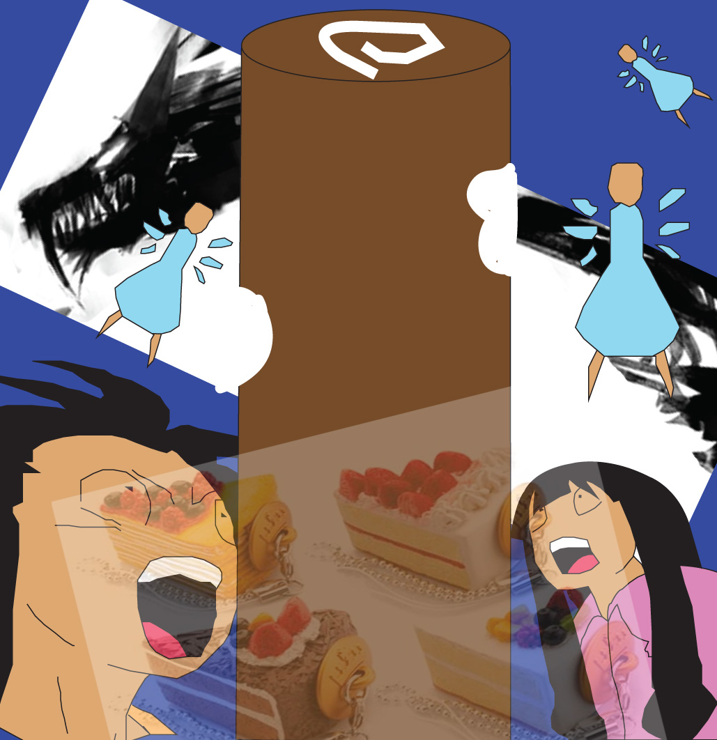
Everything that started has to be ended. So, here I am the final artwork of my assignment three. Credits must be given to Secret Recipe for the cakes and Charlene Ng Andrew of helping me at my Dragon drawing for the 2nd artwork.

There is a small changes in my initial design. At 1st, I was planning to use purely hand-drawn, but turns out the drawing doesn't come out nicely from what i expect. So, i change it into digital. At the same time, I found out that Penang people likes to use simple drawing to represent themselves or express their feeling. So, i change my total design into a very simple-ish artwork.

The basic idea is I combine both digital and sketch into a artwork. So, is very digital-ish and some are very sketch-ish.

Well, I think the picture is better to explain everything right ?? here we go. My final artwork ^^
Name: Cheng Khai Wen
ID: 1081101572
Title: Unpredictable Jam

Artist statement: I use the shock express to show the unpredictable feeling. The dragon i use black since is at night, Black represent night the best. I use yellow to represent bread. I draw my artwork very comic-ish is because now-a-days teenagers or even adults likes to read comics.

Artwork treatment: I use both Adobe Illustrator and Adobe Photoshop to create the artwork. I use brush tools to create the sketch-ish dragon to show the shadow of the dark and is actually the lights of the cars.
Name: Cheng Khai Wen
ID: 1081101572
Title: Food tower

Artist statement: I still use back the shock expression for this. Since my survey say food and Komtar can represent Penang. So, I changed Komtar in a Swissroll and the cars are the cakes. The dragon remains as representing the night The Fairies are representing the thinking of people who went to Penang just for the food.

Artwork treatment: I use both Adobe Illustrator and Adobe Photoshop to create the artwork. And a very special thanks to Charlene Ng Andrew who helped me to "filter" or make a much nicer Dragon. The white part actually represent the part that is eaten up by the fairies which can also means that the people who went to Penang is always hunger for more food.

Assignment three Research Base

Here goes my research and mindmap and also the question i going to ask.


Basically, I am asking the people how they feel about penang, what can represent penang and how they feel about Penang morning and night view while traffic jam.

Based on the survey I receive back, here is the result.

My target audience: 13 to 30 years old.

What expression represent Penang ?
- happy - 25%
- sad - 10%
- excited- 10%
- unpredictable - 55%

What color represent Penang ?
- warm - 65%
- cold- 32%
- other- 3%

Which culture represent Penang ?
- Chinese - 23%
- Malay - 20%
- Indian - 10%
- Japanese - 2%
- British - 1%
- All - 44%

Which tourist spot can represent Penang ?
- Penang Bridge - 25%
- Penang Hill -2 %
- Kek Lok Si Temple - 13%
- Gurney Drive - 10%
- Queensbay Mall - 1%
- Komtar - 49%

What you like about Penang ?
- Food - 55%
- Tourist Spot - 2%
- Landscape - 11%
- Beach - 1%
- Festival - 1%
- Shopping - 30%

You prefer day or night to enjoy Penang's landscape ?
- Day - 32%
- Night - 68%

Main Reason why night: The light on the island or roadside is beautiful.

Here is my sketch of the final artwork.
This is the 1st artwork, it shows the unpredictable different between the day and night traffic jam. Morning I draw the car as breadstick because morning people will somehow think of food while at night i draw like a dragon body because, the lights from the traffic and the side-lights will create the illusion of the dragon.
This is the 2nd artwork. This is to show the food side of Komtar that can represent Penang. The dragon behind represent the night-lights and the cakes below shows the traffic while the fairies that are eating the "Komtar" shows that people likes to eat.

Assignment three Briefing


MEDIA ART 1 : MMA1113
Assignment 03 Brief : Digital Arts

This is an individual project. Students are required to combine the use of
expressive visuals and creative typographic to create TWO artworks based on
selected topic. Both artworks should carry two different themes
(treatment, “look and feel” and art concepts) but for the same target audience.

Please choose your potential target audience.

Submission Format:
Two 10"x10" mounted on foamboard.
CDROM (all your digital working files, research/ findings and two finals artwork)
A4 sketch

Your A4Sketch should contain:
- Project brief (Name, id, artwork title, artist statement, artwork treatment (on both artworks)
- Survey results on your potential target audience
- Any samples and reading materials related to your topic.
- Idea development (thumbnails & sketches)
+Any added segmentation is a bonus

Note:
You can always add physical experimental effects or objects
on printed artworks.

Evaluation Criteria:
Artist statement: 4%
Creative concepts and expression: 16%
Idea developments and sketches: 10%
Total: 30%
Submission: week 09


Our topic must be related to Penang. Well, I didn't join the trip to Penang but due I am born there. So,i chose "Traffic Jam" as my topic for assignment 3. Why traffic jam? Actually a small island like Penang also have a huge traffic like KL. But the beauty of the traffic jam is totally different feel when is at night and morning.

Tuesday, August 2, 2011

Assignment two Final Phase


Between all of this, I have to choose one.
- image as letter
- letter as image
- word as image
- word within word
- letter plus image
- word plus image
- text type as image

So, i choose letter plus image to start my assignment.

The 1st design i make is putting the Guy Fawkes Mask as background, and the words in front to show the focus.
The 2nd Design is also my final design, i replace the background with the big shadow i use in assignment 1 and merge the Guy Fawkes Mask as the face. The words remains the same.

Here is my final artwork.
Name: Cheng Khai Wen
ID: 1081101572
Title: Expect Us, Anonymous

Artist statement: This Quote is quite famous within the Internet world. I use Red color because to show the awareness and danger of Anonymous. Red is used to represent Danger. The big shadow behind is showing Anonymous can be Evil when comes to Internet Human Rights.

Artwork treatment: I use back the photos I use for my assignment one. I use Adobe Photoshop to merge and position the wording and the pictures together. The font I use is the already build-in Photoshop font, Tele-Marines.